Client
Joyful Simplicity
Timeline
3 Weeks
SERVICES
Naming, Strategy, Visual Identity

CHALLENGE
A lot of outdoor products for kids lean heavily on aesthetics. Bright colors. Playful fonts. Animal mascots. But when you’re talking about kids outdoors, parents aren’t just buying cute. They’re buying safety. Comfort. Peace of mind. If the brand doesn’t communicate that instantly, it loses trust before it even gets considered.


SOLUTION
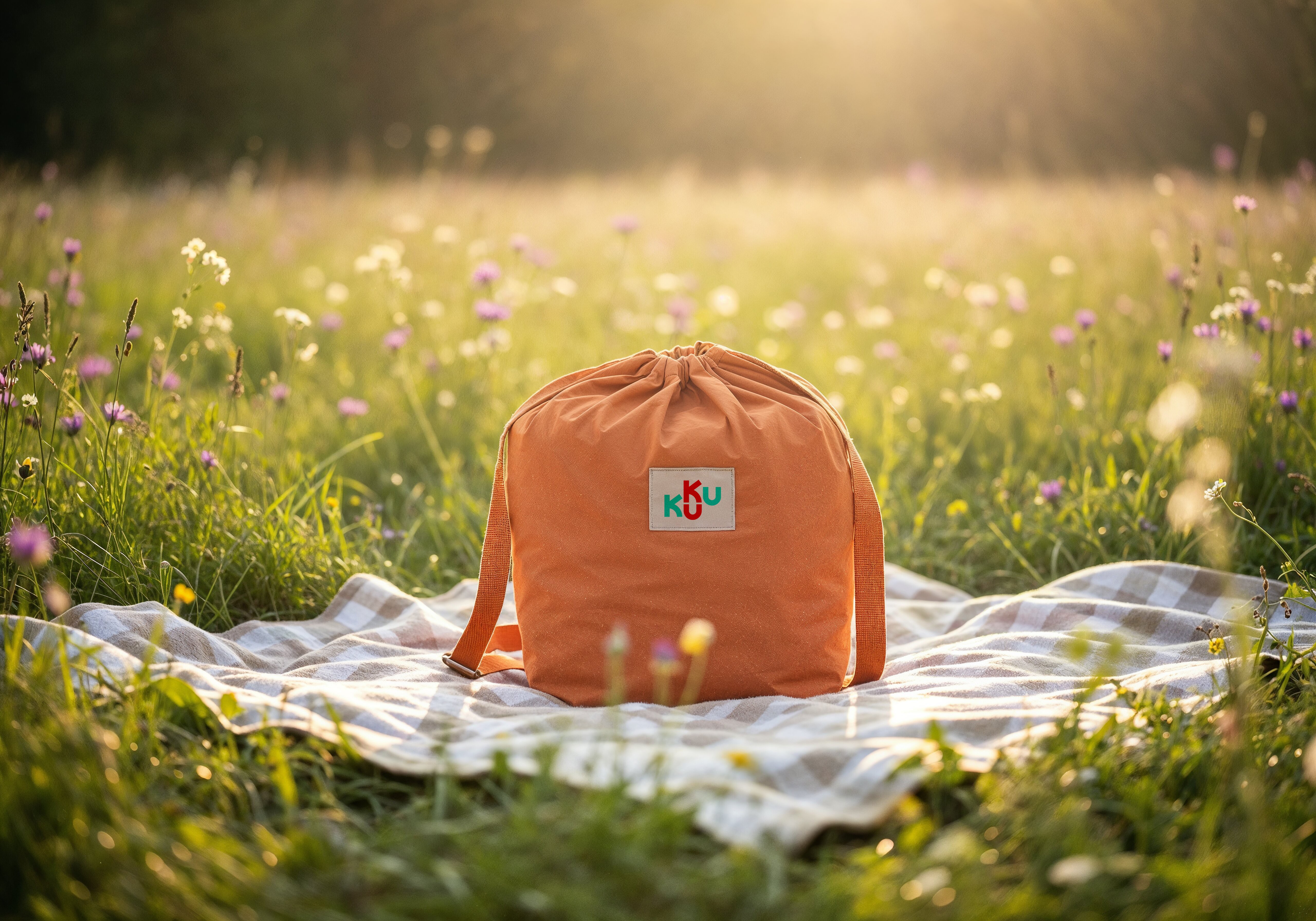
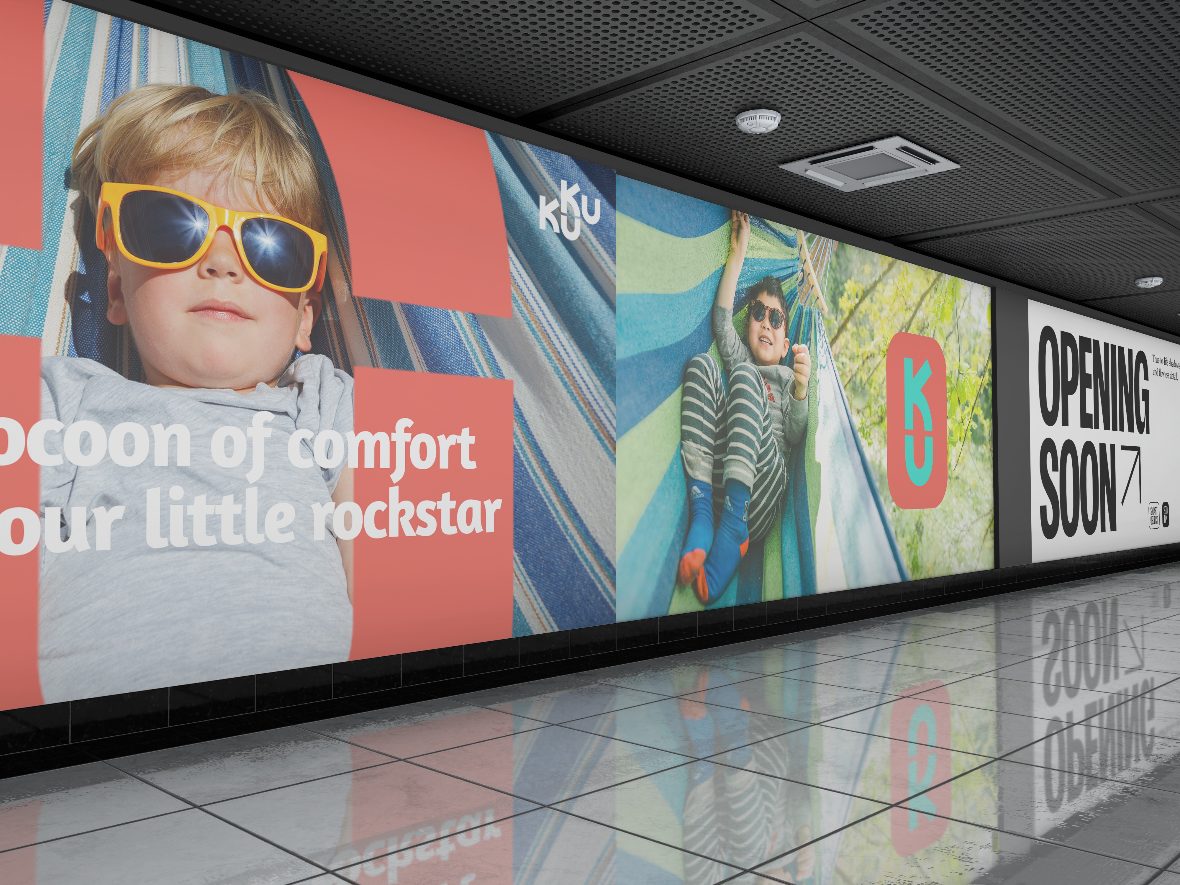
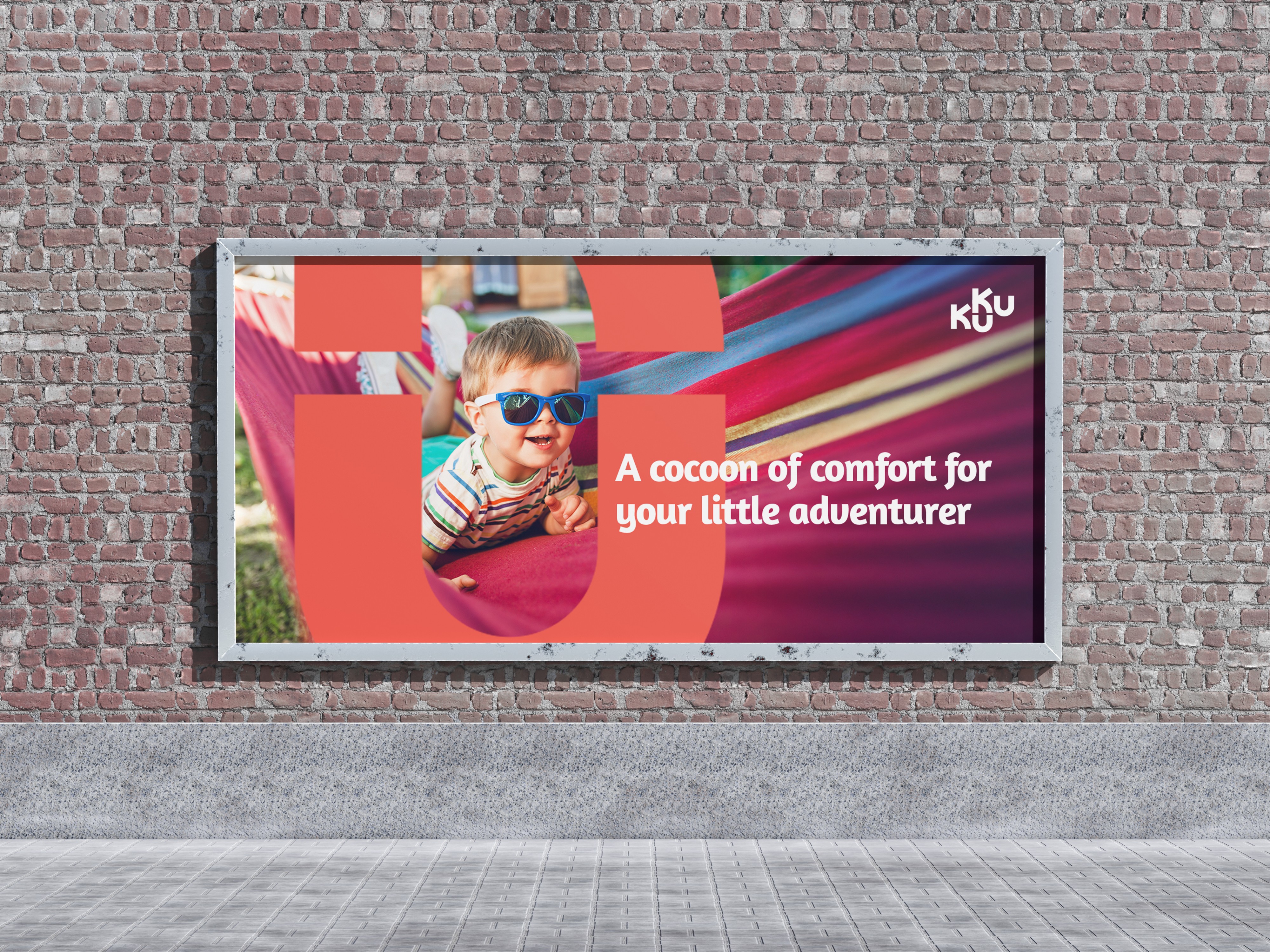
The strategy was simple but intentional. Don’t lead with fun. Lead with reassurance. We built the brand around one core tension: kids crave adventure, parents crave assurance. The identity had to sit confidently in between. Warm but structured. Playful but stable. Soft in tone, strong in presence. Kuku Hammocks is positioned not just as a hammock brand for kids, but as an outdoor comfort brand where safety is the baseline, not a bonus feature.

RESULT
The result is a brand that feels instantly trustworthy without losing its sense of play. Kuku Hammocks stands out by not competing on “cuteness,” but by owning reassurance in a category that often overlooks it. The identity creates a stronger emotional connection with parents while still staying approachable for kids. It’s a brand that makes the decision easier. Less second-guessing, more confidence to say yes.