
Case Study
Branding the Next Generation of Squash

BRAND NEW VISUAL IDENTITY
Creating a fresh new face for Australian Junior Open (AJO), one of the most anticipated junior squash events in Australia.
The brief was to create a visual identity that balanced professionalism with youth appeal. As a premier junior squash event, AJO needed a brand that could resonate with younger athletes while still aligning with Squash Australia's established identity. My task was to develop a fresh, dynamic design that felt bold, approachable, and unmistakably tied to the fast-paced nature of the sport.


01
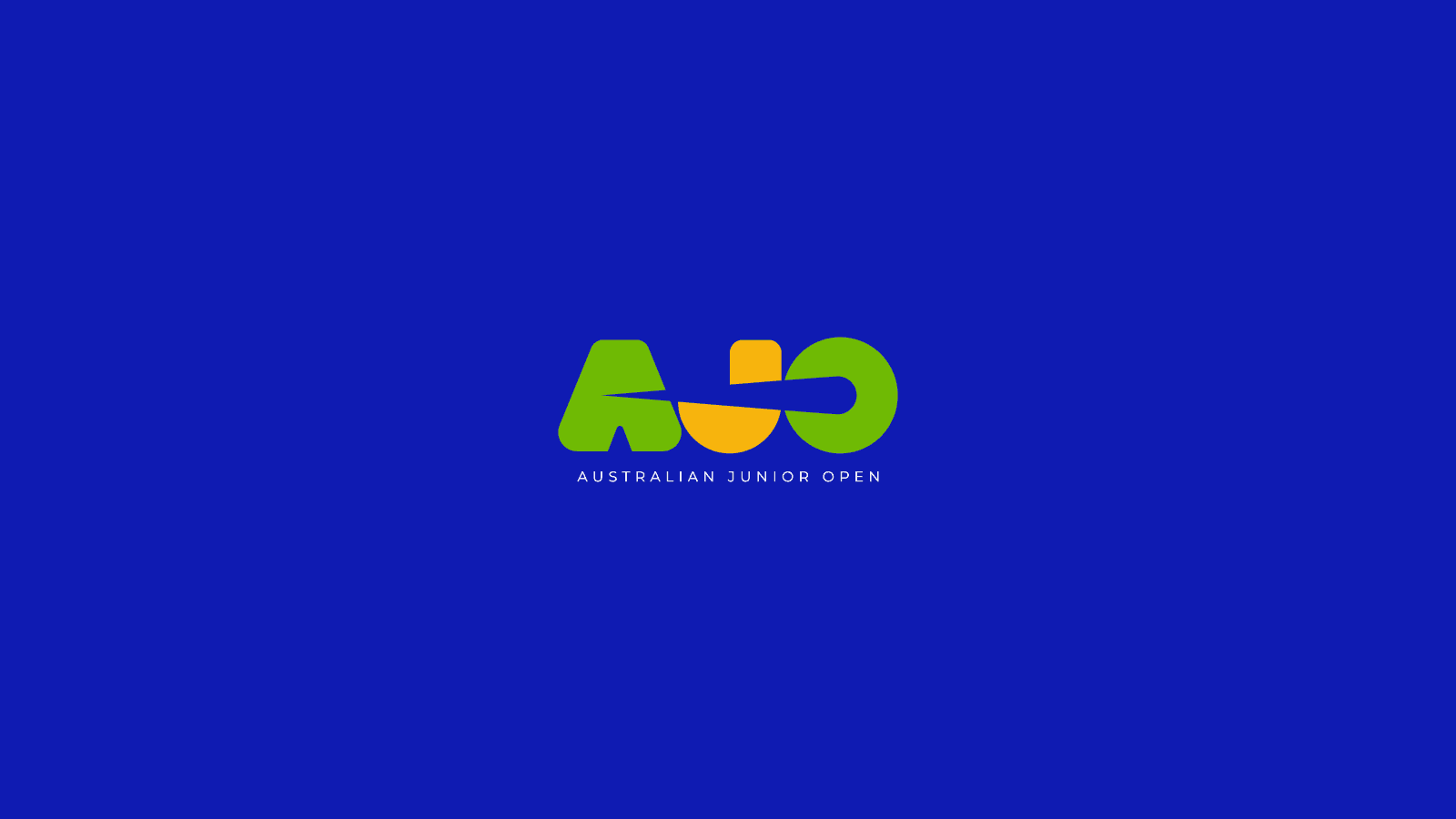
Built on the name everyone already uses: AJO
02
A speeding ball hidden in the negative space
03
A lighter green, true to Squash Australia
04
Youthful energy with national prestige
Speed in every letter
Since the event is popularly known across the country as "AJO", I capitalised on this opportunity and designed a bold yet youthful logotype that captures the energy of the tournament. Rounded corners and a fresh, lighter green (inspired by Squash Australia's palette) give it a modern, junior-friendly feel. The standout feature? A dynamic negative space running through the letters A, J, and O — representing a speeding squash ball and paying tribute to the sport’s fast-paced action.
01
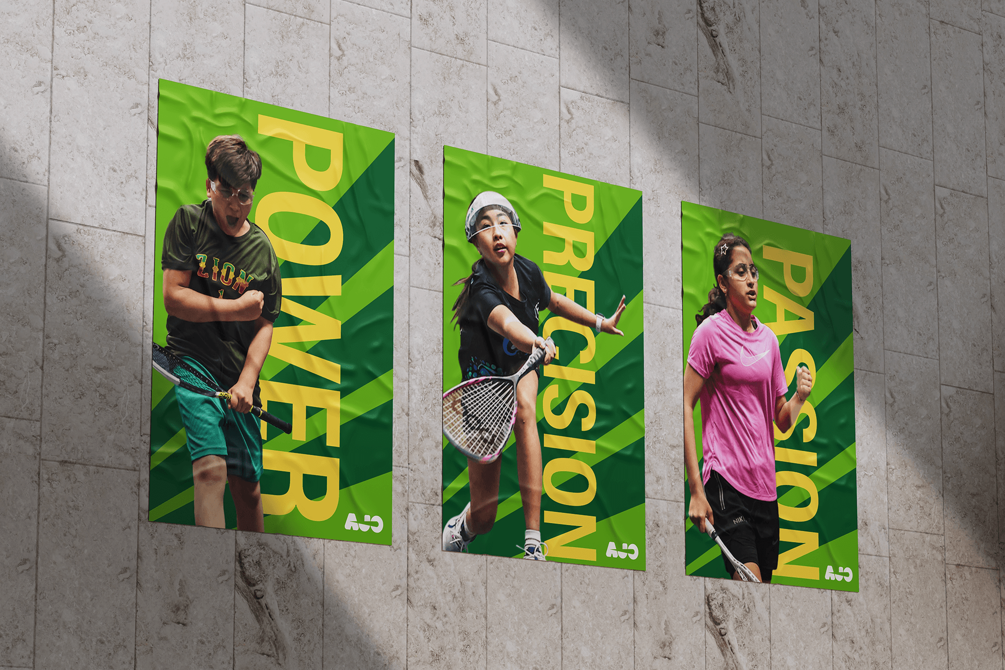
Power, precision and passion
A poster series built on three words gives the tournament a confident, athletic voice in print.
02
Visible around the venue
Lamp-post banners promote the tournament and its app, carrying the bold logotype into the spaces around the event.

03
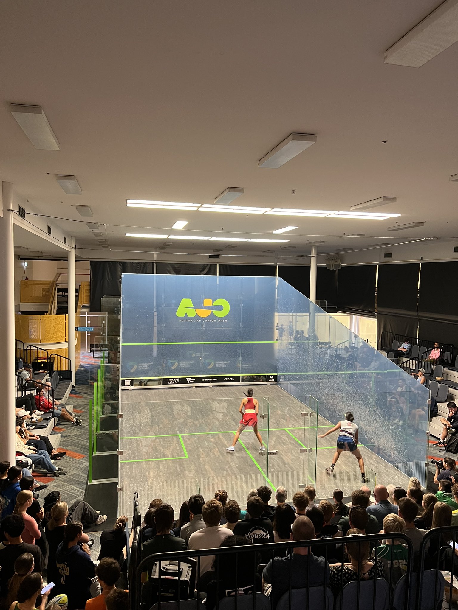
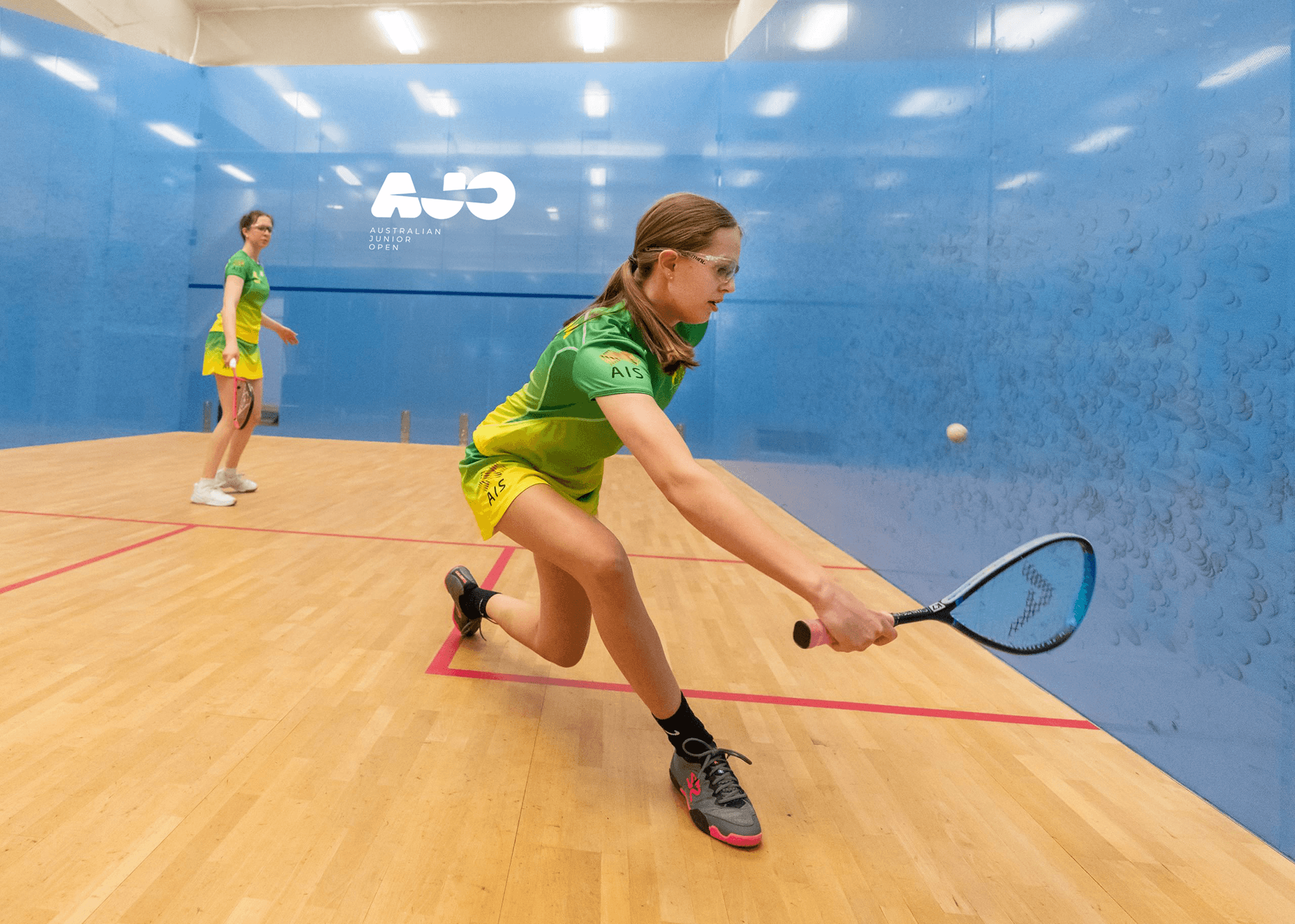
Made for the next generation
The identity lives on court alongside the players, capturing the fast-paced action the logotype was designed around.
04
Merchandise with a premium edge
Caps, bottles and gold-embossed leather goods show the logotype working as well on keepsakes as it does on court.

A standout on the squash calendar
The result is a vibrant and contemporary visual identity that elevates the Australian Junior Open’s presence and reflects the spirit of the next generation of squash players. The new AJO branding not only captures the energy and excitement of the event but also provides a strong, cohesive look that stands out across digital and print platforms. It successfully bridges the gap between youthful enthusiasm and the prestige of a nationally recognized tournament, positioning AJO as a standout event in Australia’s squash calendar.
More Work