Case Study
Rebranding a WWI & WWII Living History Experience
Visual Identity Refresh
Battlefront Malta is a non-government organisation based in Malta comprised of World War II collectors, researchers, and reenactors. With a mission to provide a comprehensive and multi-disciplinary perspective on the second world war, their team is dedicated to educating and engaging the public through organised events and exhibitions to explore both tangible and intangible heritage from the conflict.
Battlefront aims to capture the essence of military history through its new brand aesthetic. By revitalizing the logo and overall design, the brand seeks to evoke a sense of authenticity and fascination associated with historical military campaigns. The rebranding effort aims to establish a strong and enduring connection with enthusiasts, collectors, researchers, and those passionate about military history, while expanding its appeal beyond its existing fan base.
01
A modernised mark that keeps its heritage
02
Barbed wire built into the letter B
03
Strength, resilience and the hardships of battle
04
One voice across events, exhibitions and merchandise
History you can recognise
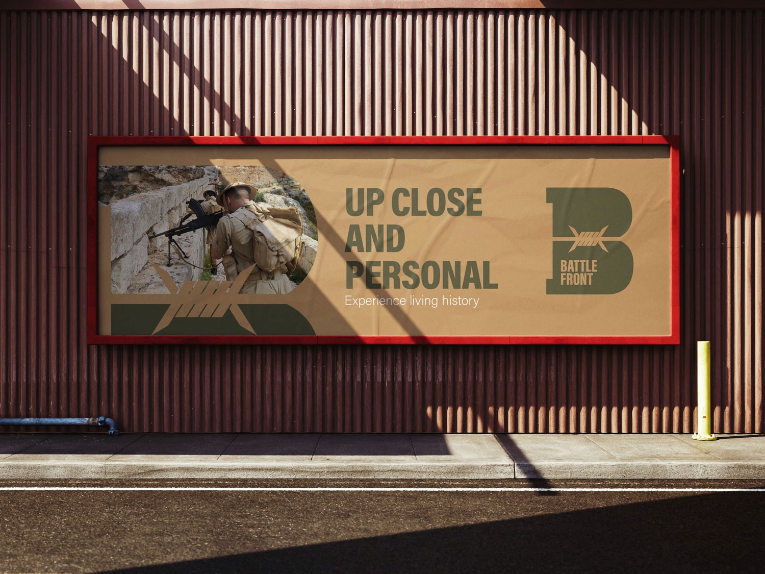
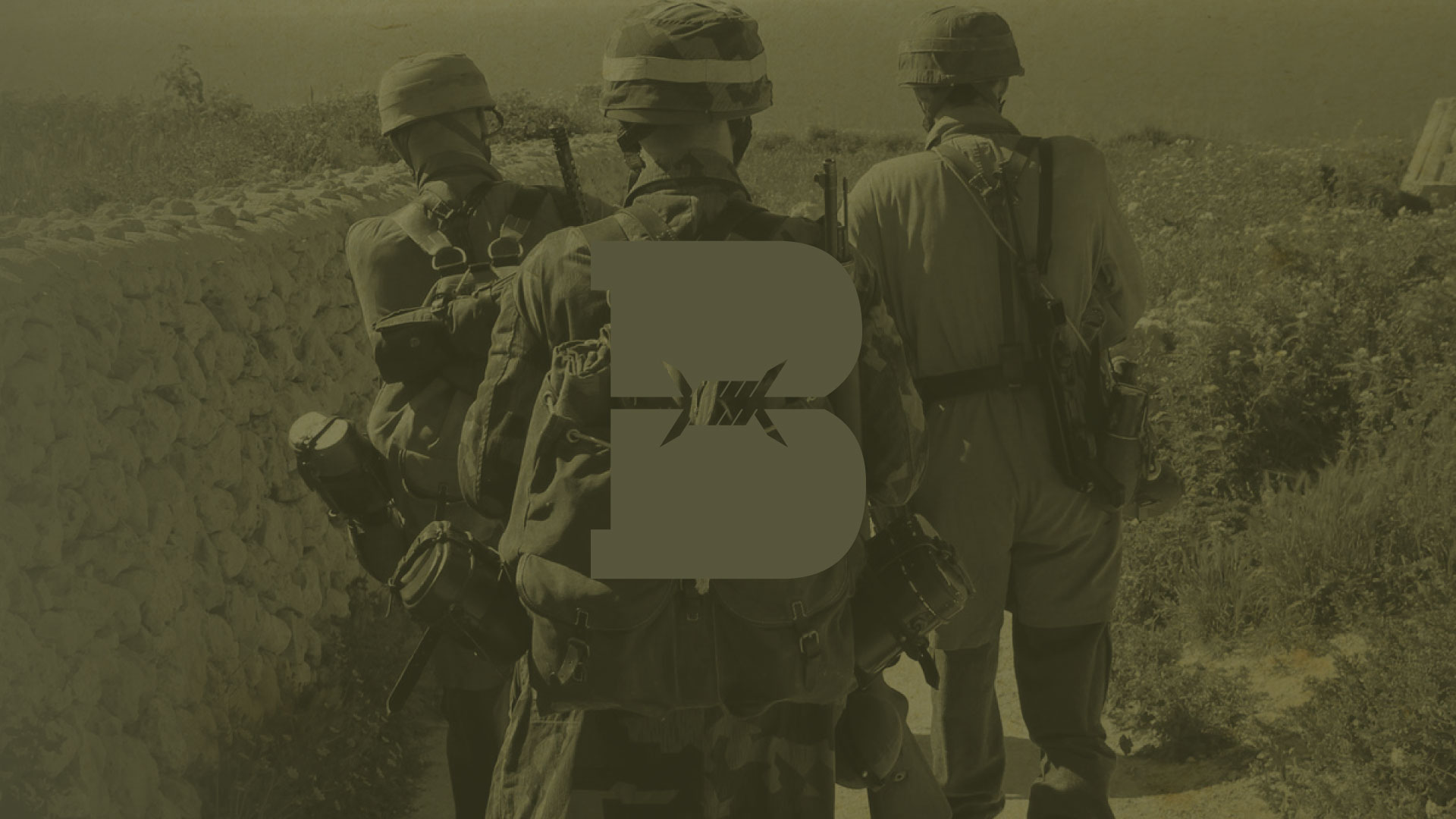
The strategy behind this logo concept is to modernize the brand through a simple yet meaningful design that retains a connection to the current identity. By integrating a barbed wire silhouette into the shape of the letter B, the logo becomes both visually distinctive and symbolically rich. The barbed wire reinforces key brand values—strength, resilience, and the hardships of battle—while enhancing the recognizability and impact of the mark.
01
Bringing history to life
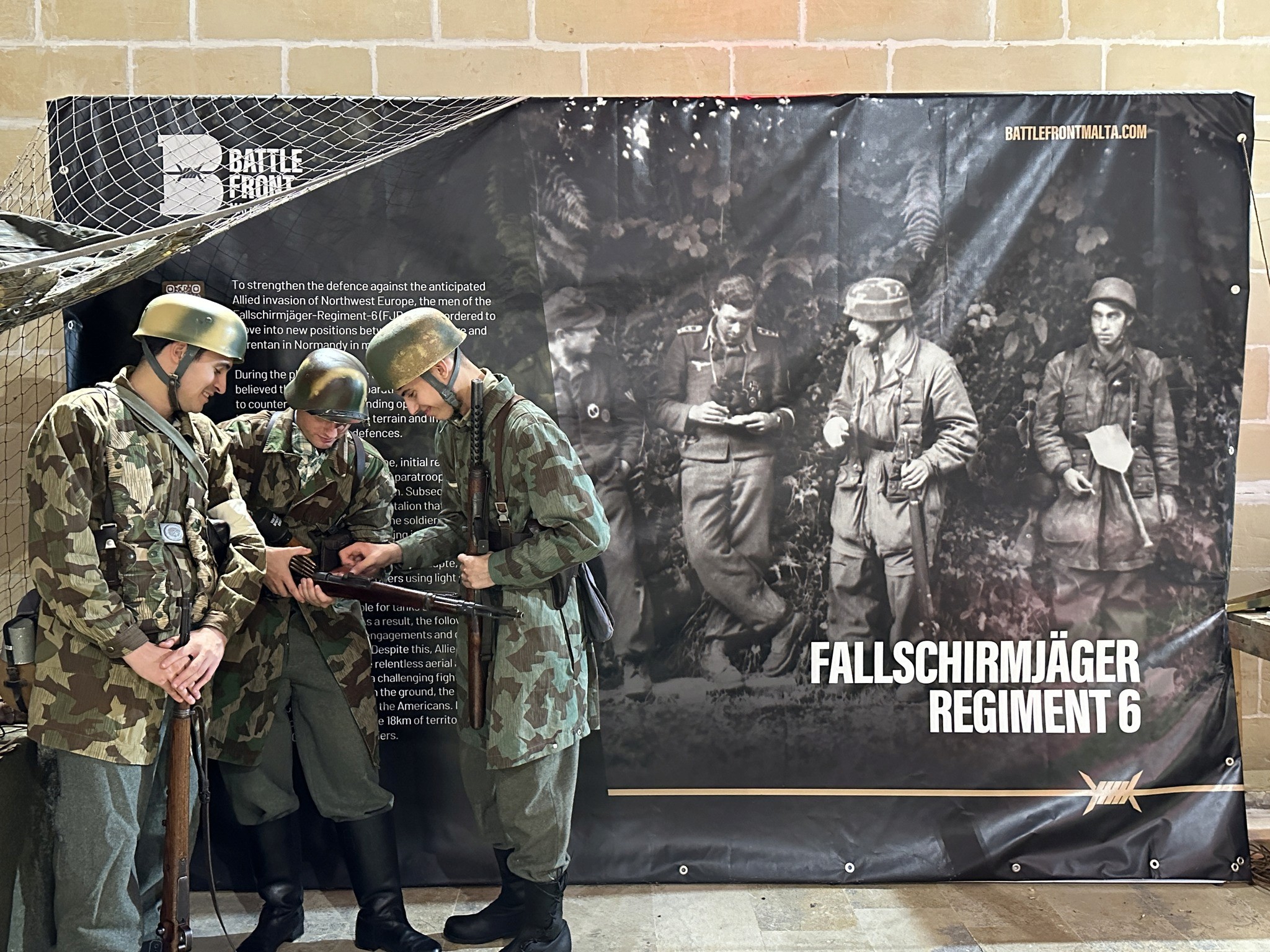
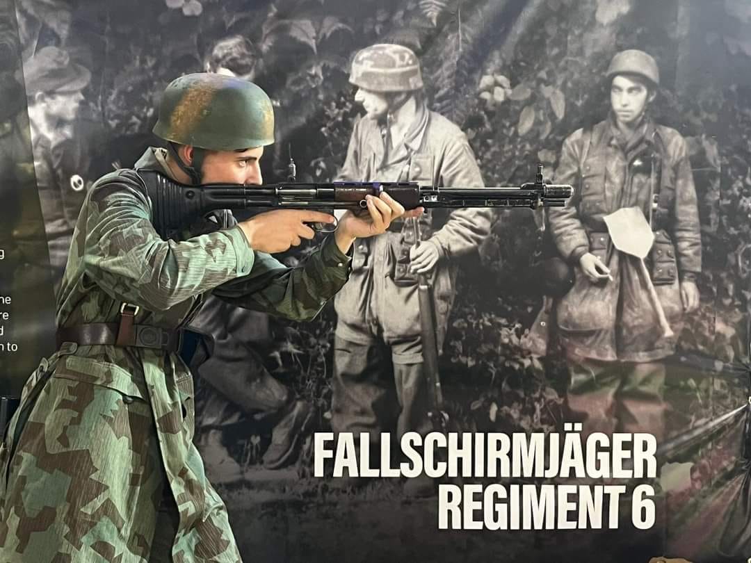
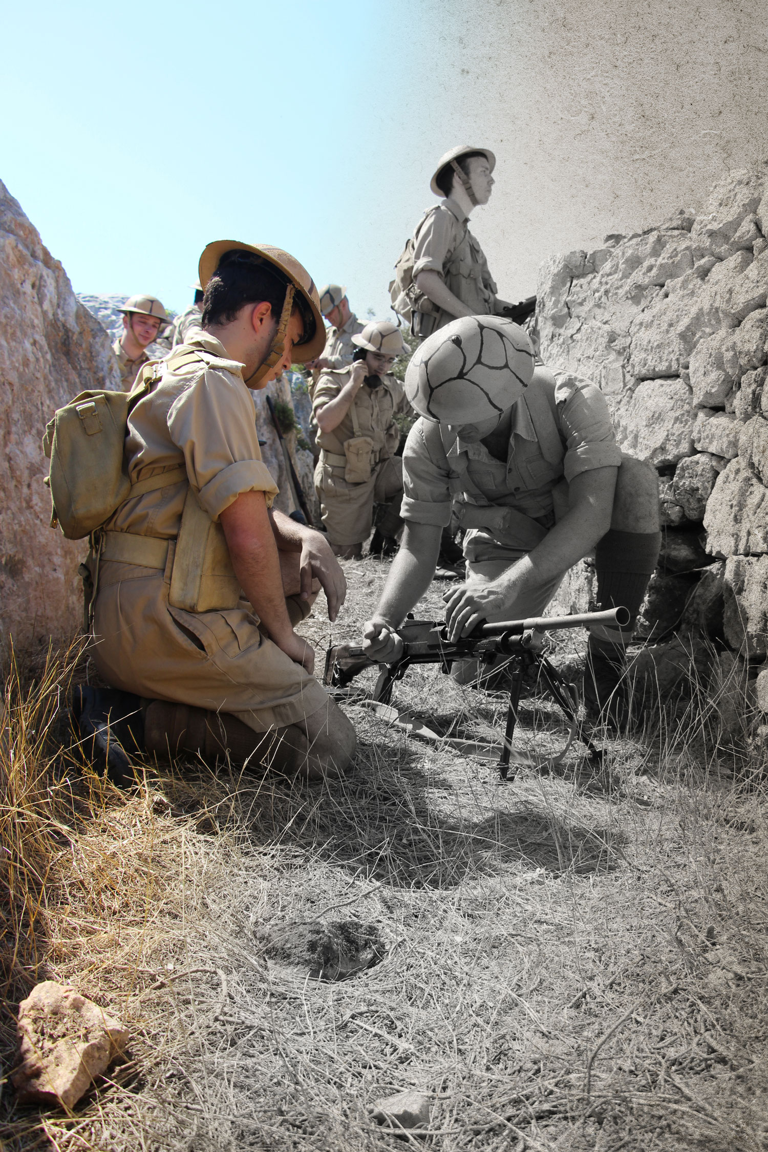
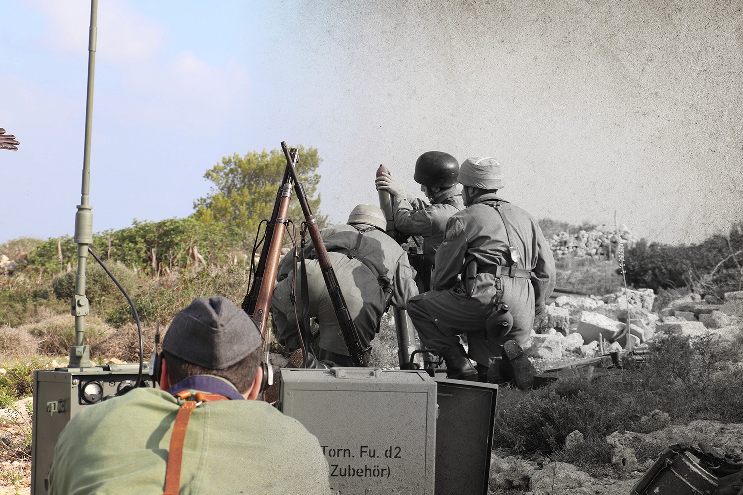
Photography of re-enactors in the field anchors the brand in the living history experiences Battlefront creates.
02
An archive-inspired look
Imagery treated in an archive style connects today's reenactments with the original campaigns, adding authenticity to every touchpoint.
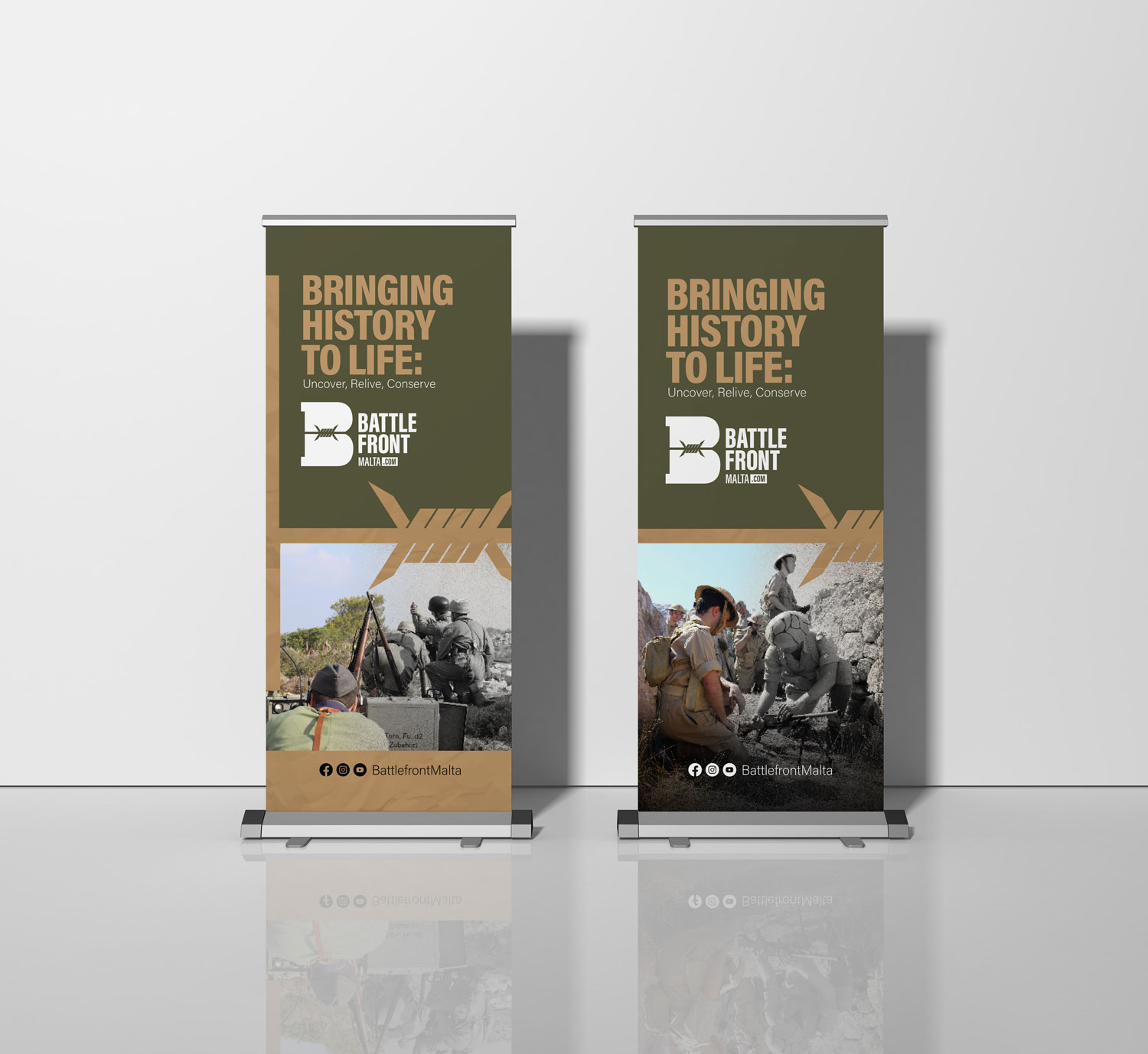
03
Ready for any event
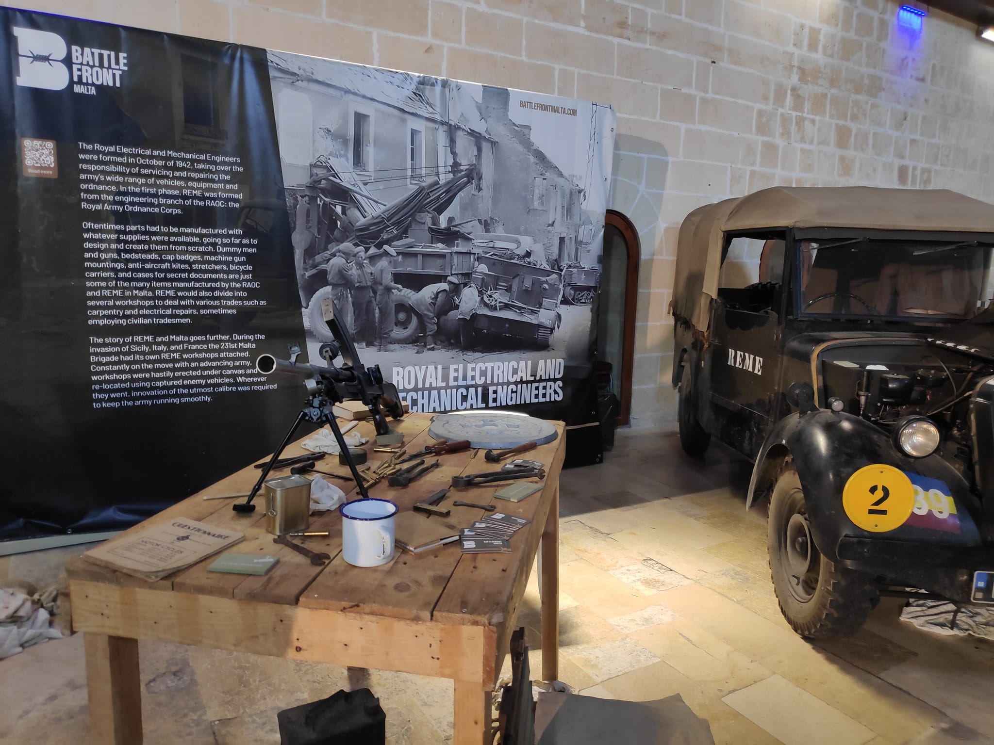
Roll-up banners and billboards carry the Bringing History to Life line, giving exhibitions and events one recognisable voice.
04
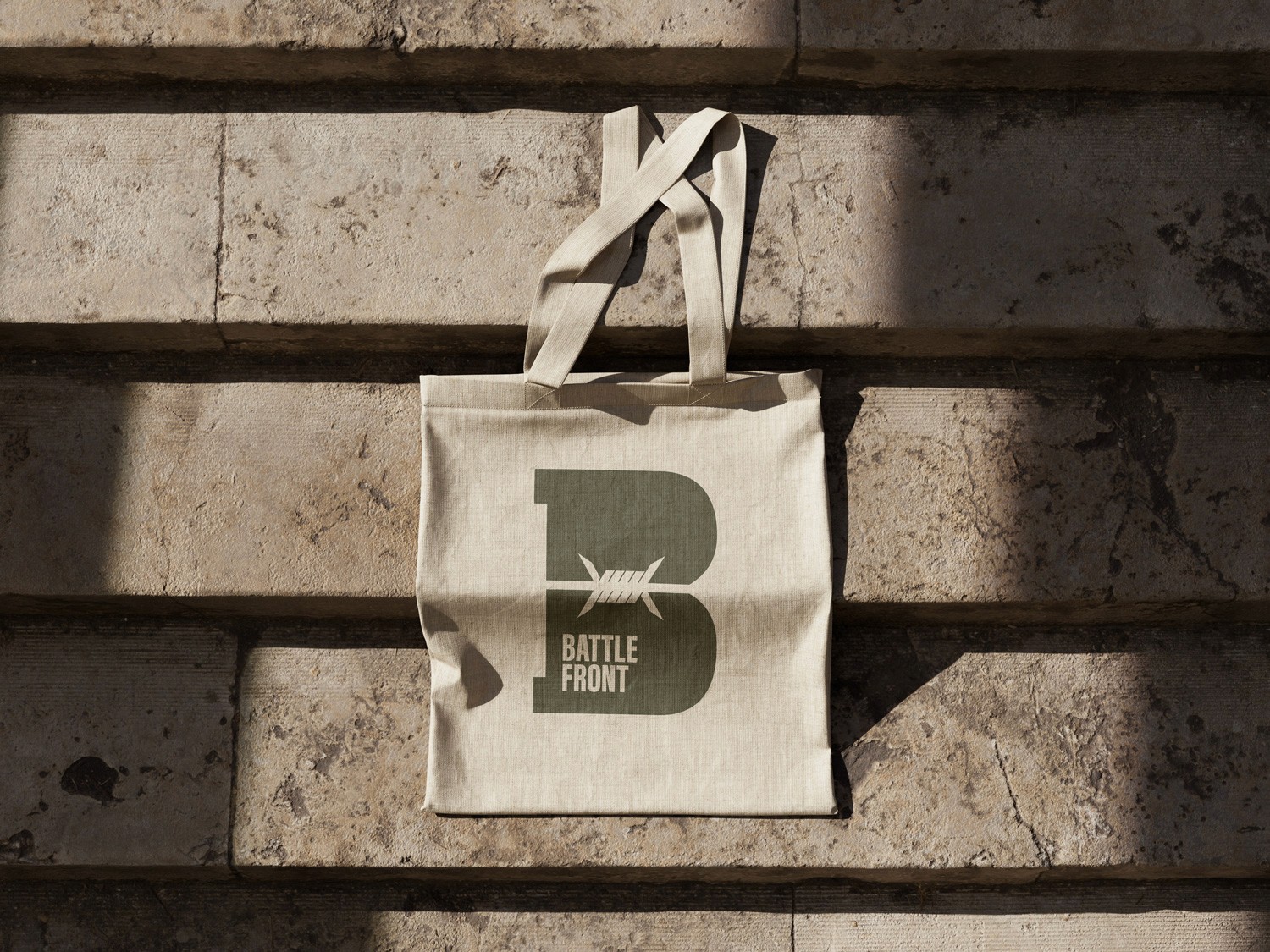
The monogram as a badge
The barbed-wire B stands on its own on totes and apparel, giving enthusiasts something they are proud to carry.
A mark that stands out
The result is a cohesive and impactful brand identity that not only modernizes Battlefront’s visual presence but also strengthens its emotional connection with audiences. The distinct logo—featuring the barbed wire-integrated “B”—has proven highly recognizable, helping the brand stand out in a crowded market. This renewed clarity and consistency across touchpoints has increased brand recall, attracted a broader audience of history enthusiasts, and contributed to a measurable uptick in website engagement and sign-ups from both longtime fans and new users.
More Work